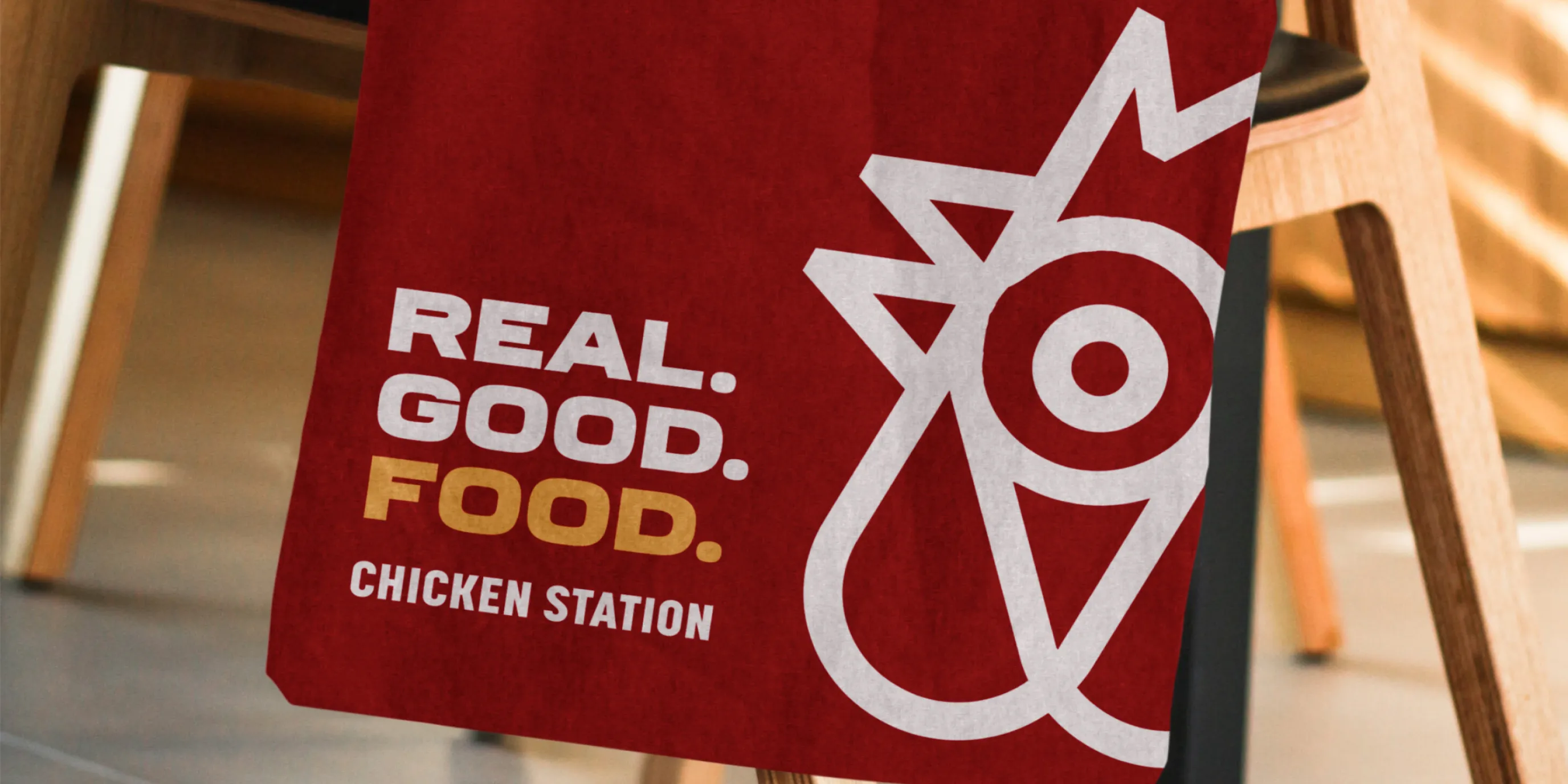
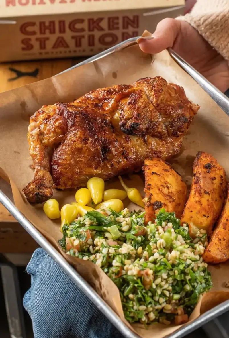
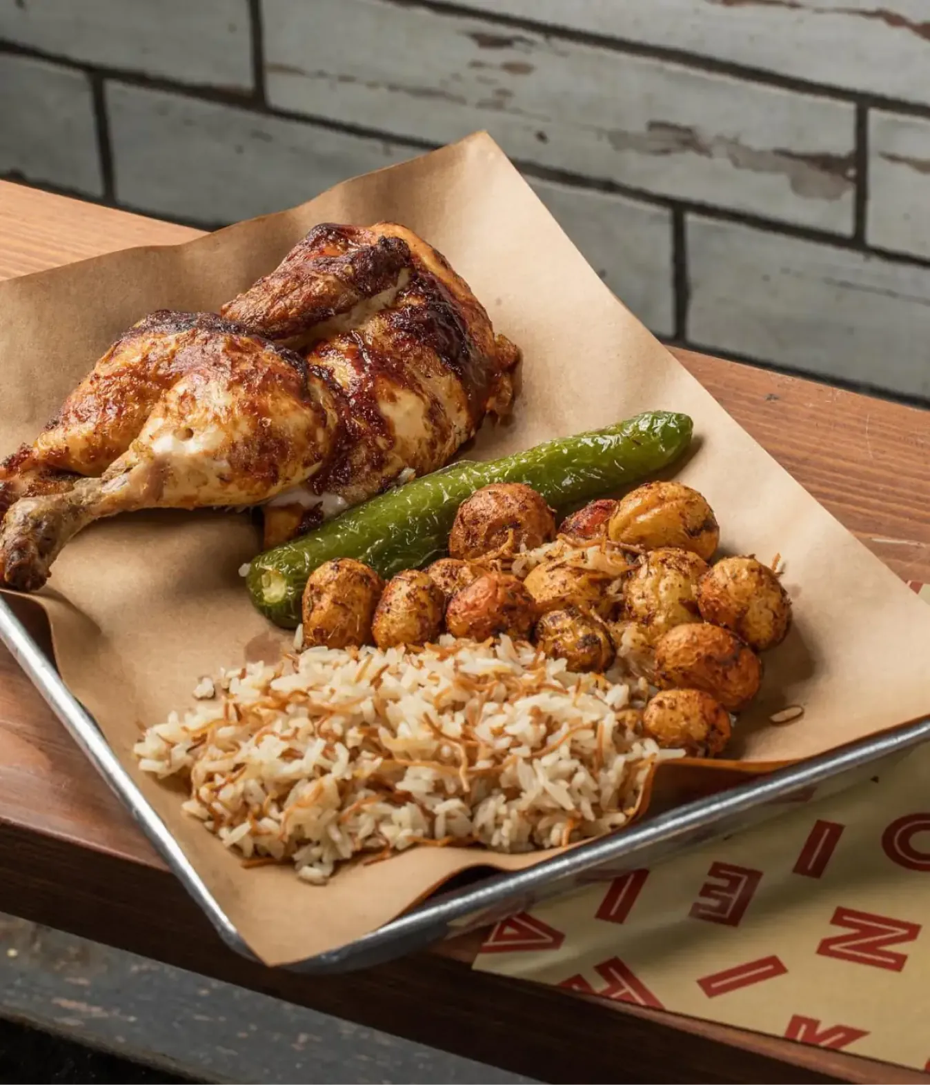
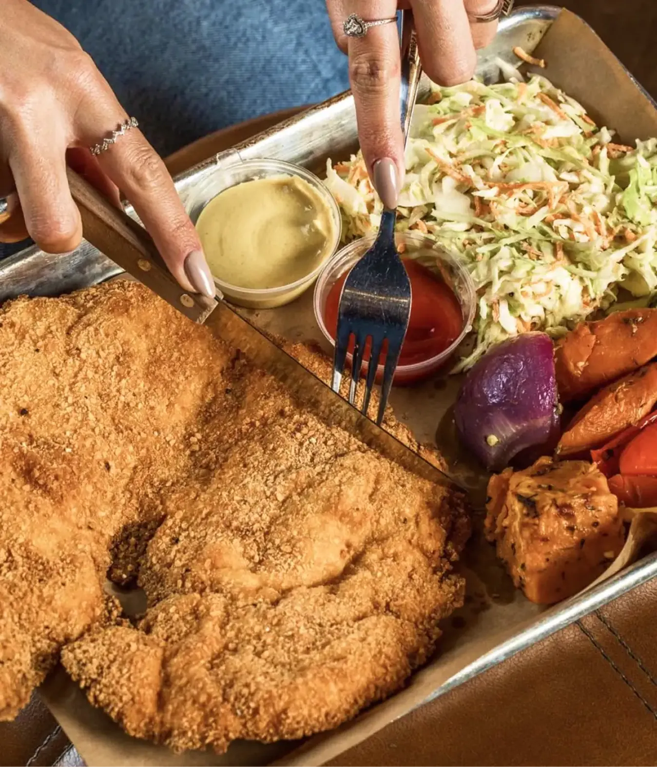
Whether dining in, or taking out, Chicken Station is the perfect lunch spot for a mid-workday break. A bold choice; filled with levity and seriously good food.
The team was ready to begin franchising Chicken Station. They had foundational colors, and a bold logo, but not enough brand elements and specific guidelines to keep consistency across properties, managed by different teams.
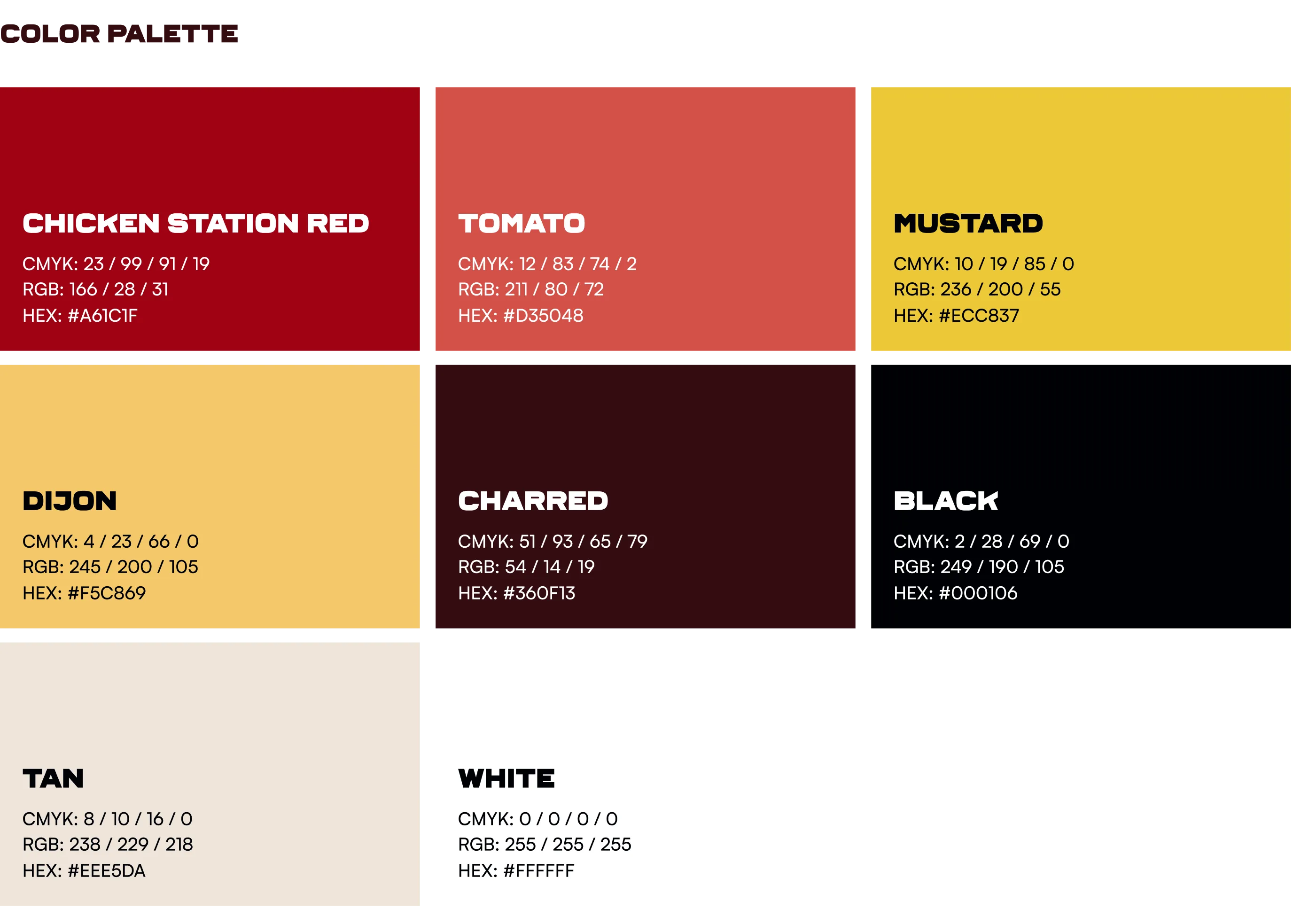
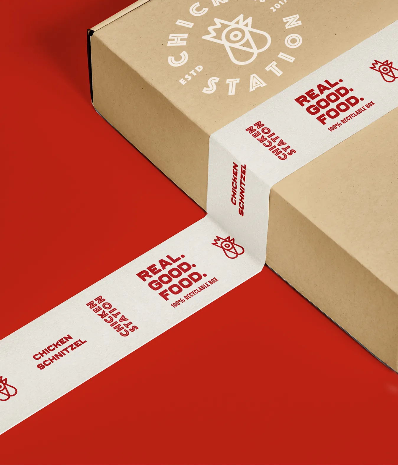
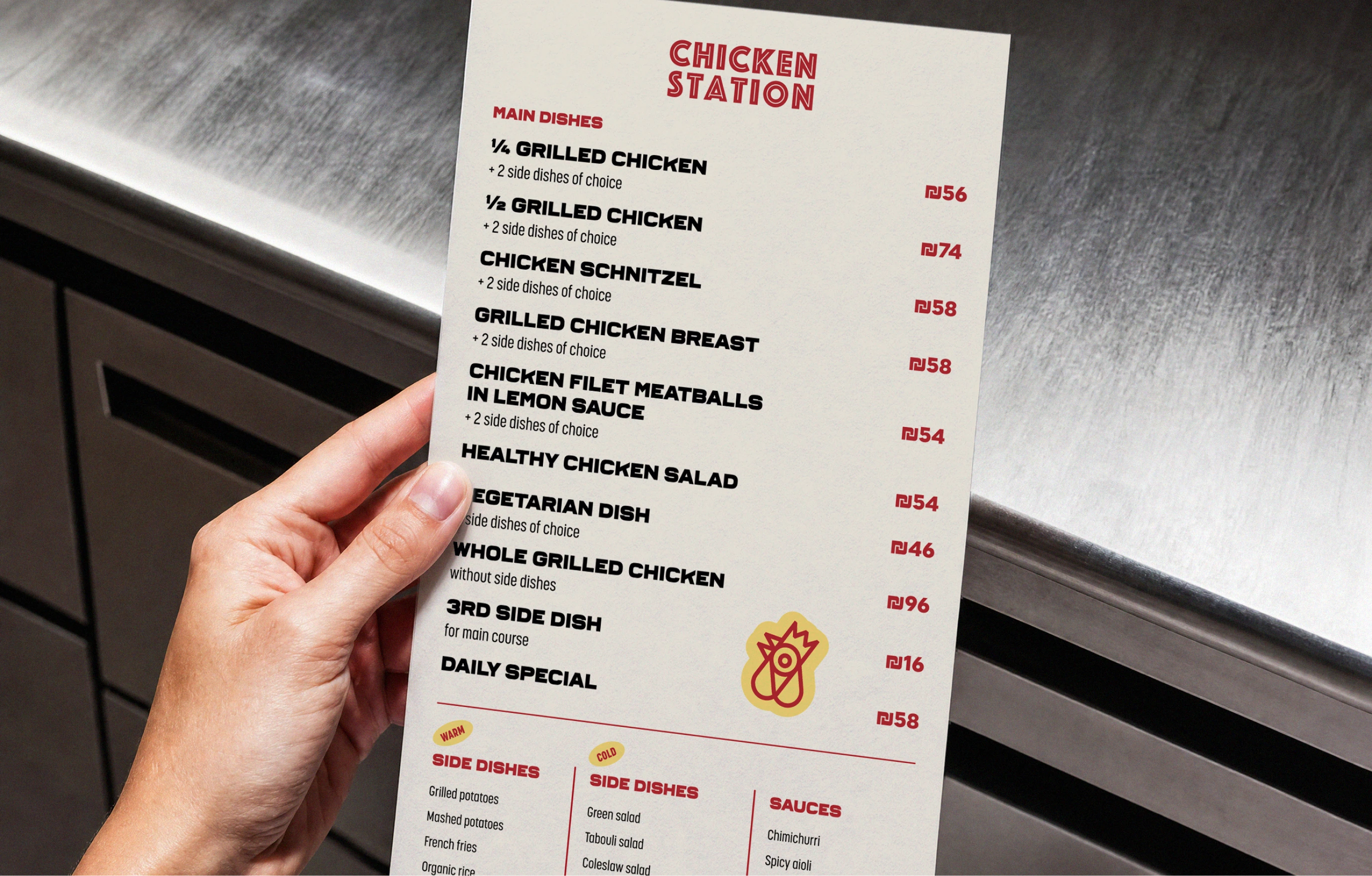
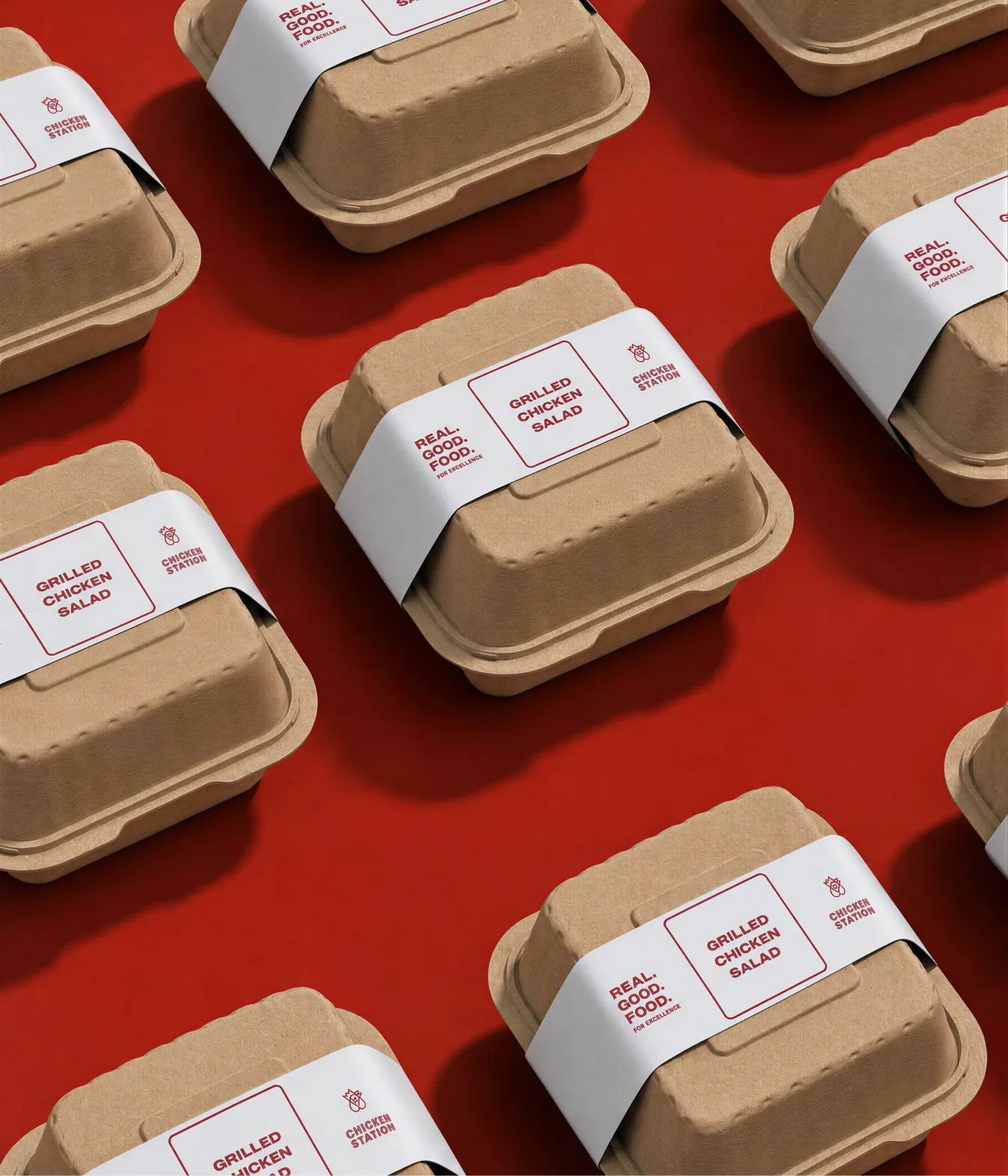
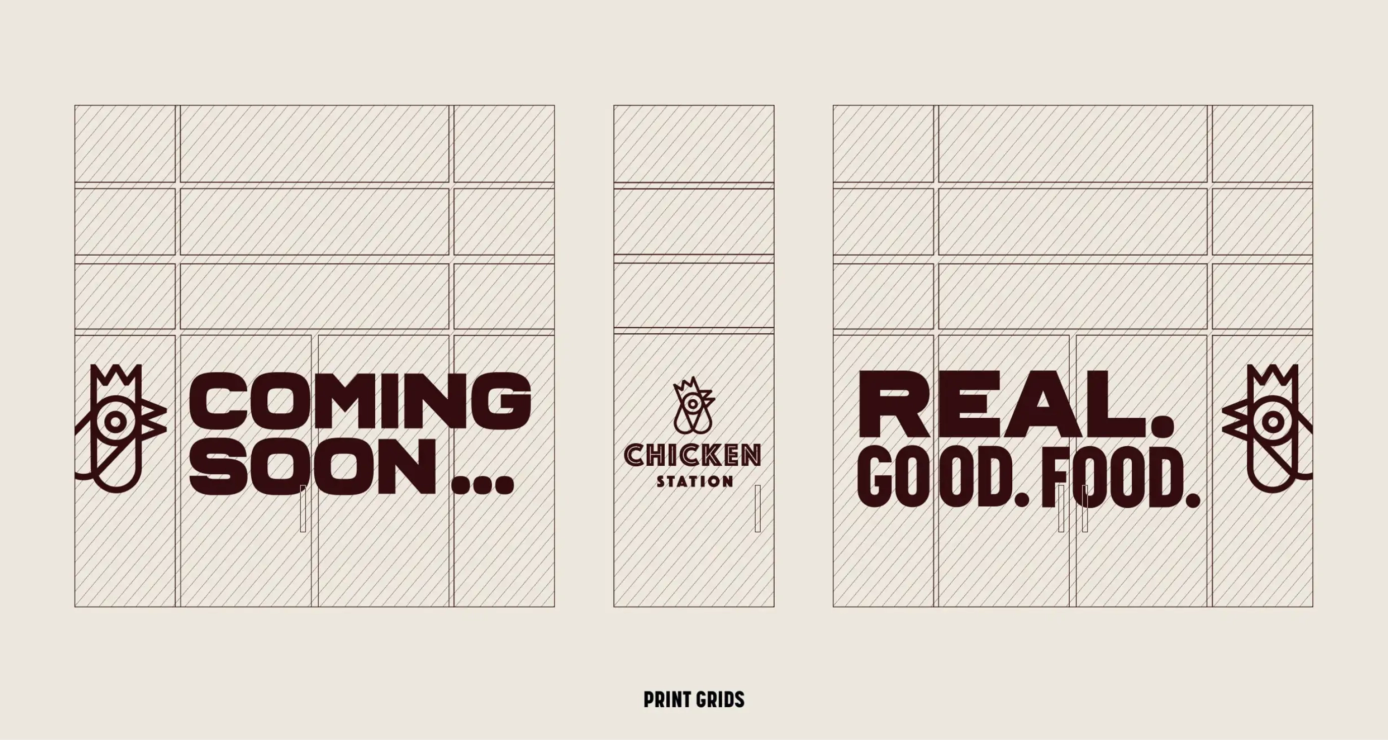
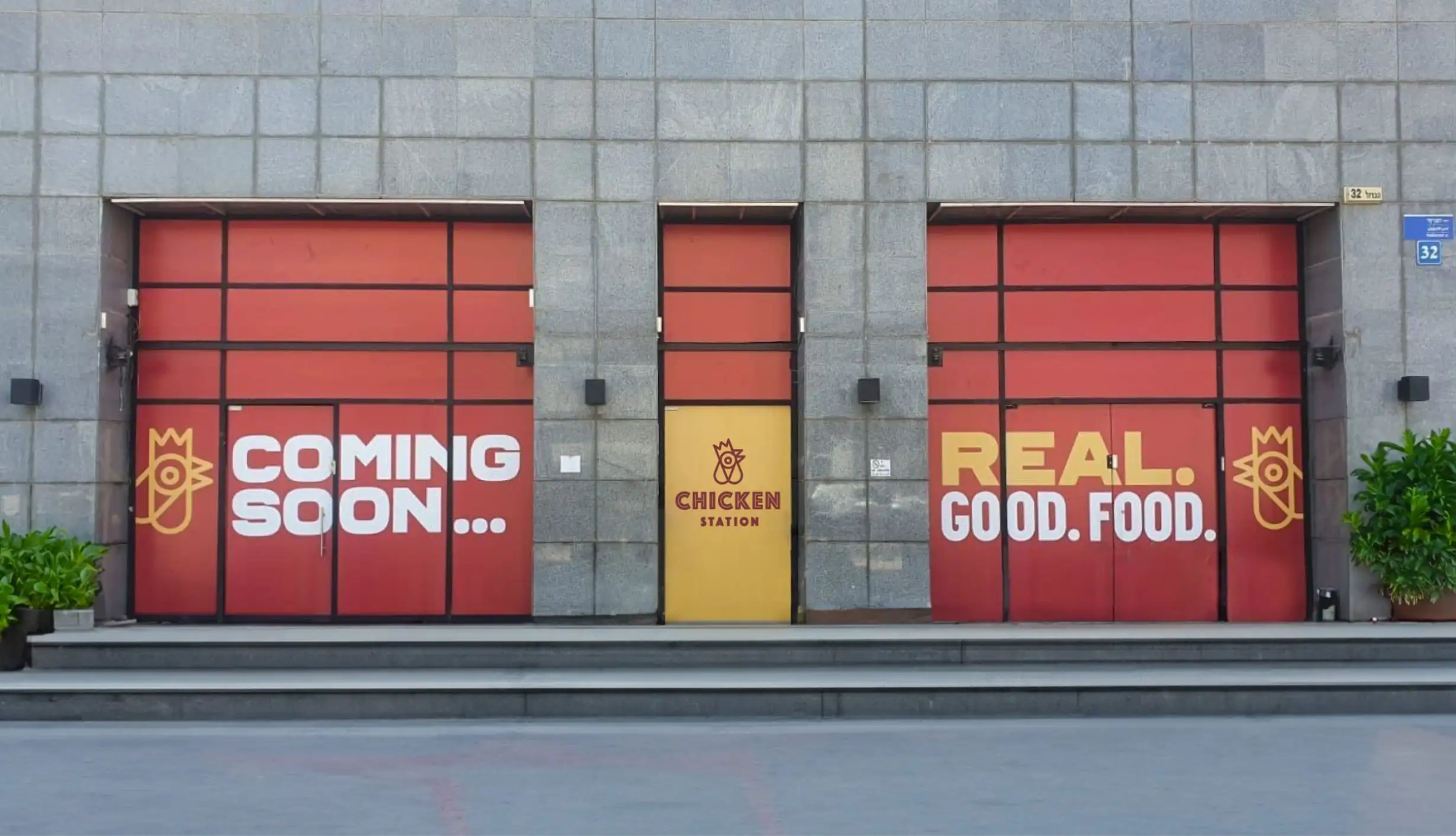
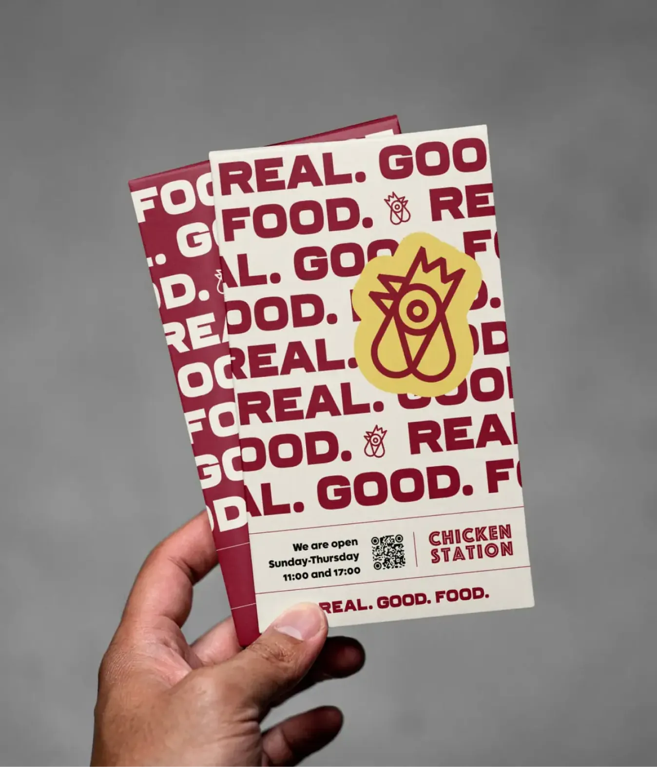
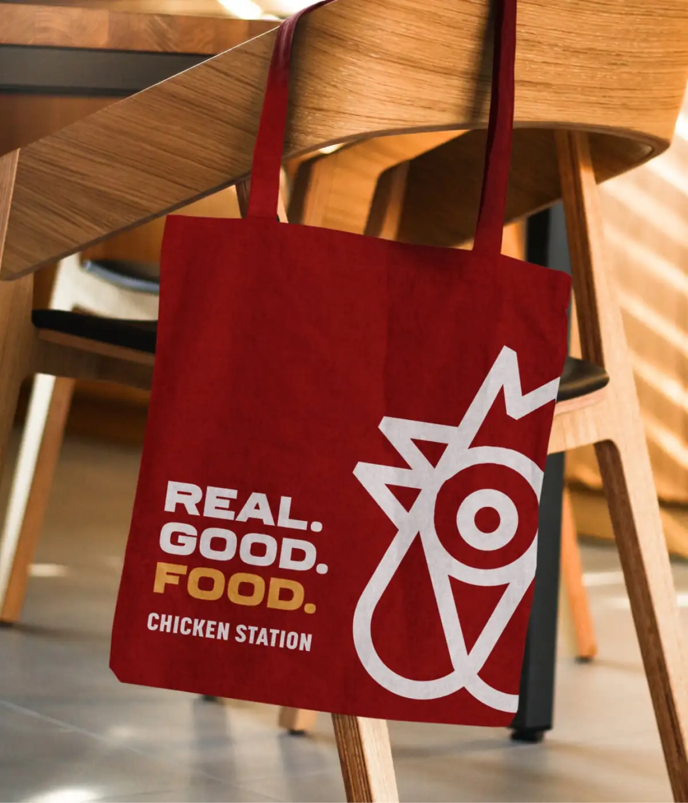
We leveled-up, and expanded their branding by defining usage of their colors, standardizing fonts, and designing physical assets like their menus, bags, to-go packaging, and signage with a wink-and-a-nod style, breaking up the customer’s work day with a bit of fun, while still reinforcing that when it comes to the food, they produce top-quality, healthy, and comforting meals.
Project developed at Craft & Root.
Project Objective
- Brand Expansion
- Brand Operations
Services
- Visual Identity
- Physical Brand Touchpoints
- Brand Guidelines & Systems
- Implementation & Rollout
Project Outcomes
- Created a Mechanism for Operations
- Accelerated Growth
“As the owner and operator of several fast food chains, I need to know that whoever builds my brands understands the industry, what people want, and how to create clear guidelines for franchisees. Just as importantly, I need a team I can rely on if things come up across multiple locations. Ariel and her team are the best in the business because they provide practical solutions without having to compromise on design.”
Momi Adamski
Owner, Chicken Station
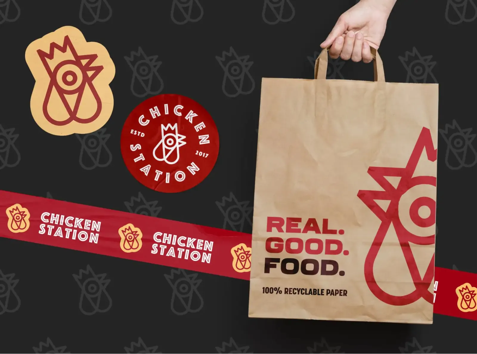
We leveled-up, and expanded their branding by defining usage of their colors, standardizing fonts, and designing physical assets.
Physical assets included things like their menus, bags, to-go packaging, and signage. We did so with a wink-and-a-nod style, breaking up the customer’s work day with a bit of fun, while still reinforcing that when it comes to the food, they produce top-quality, healthy, and comforting meals.
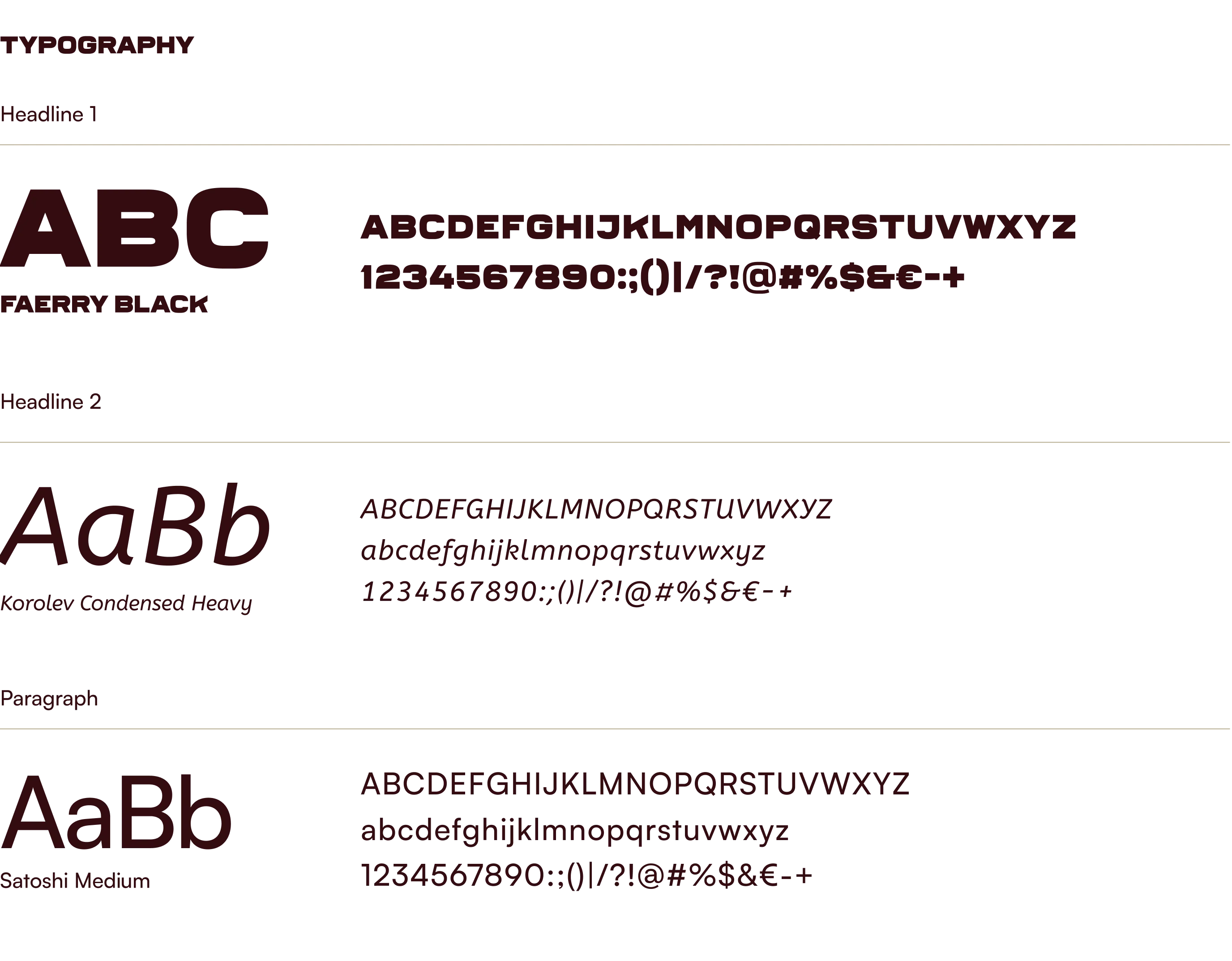
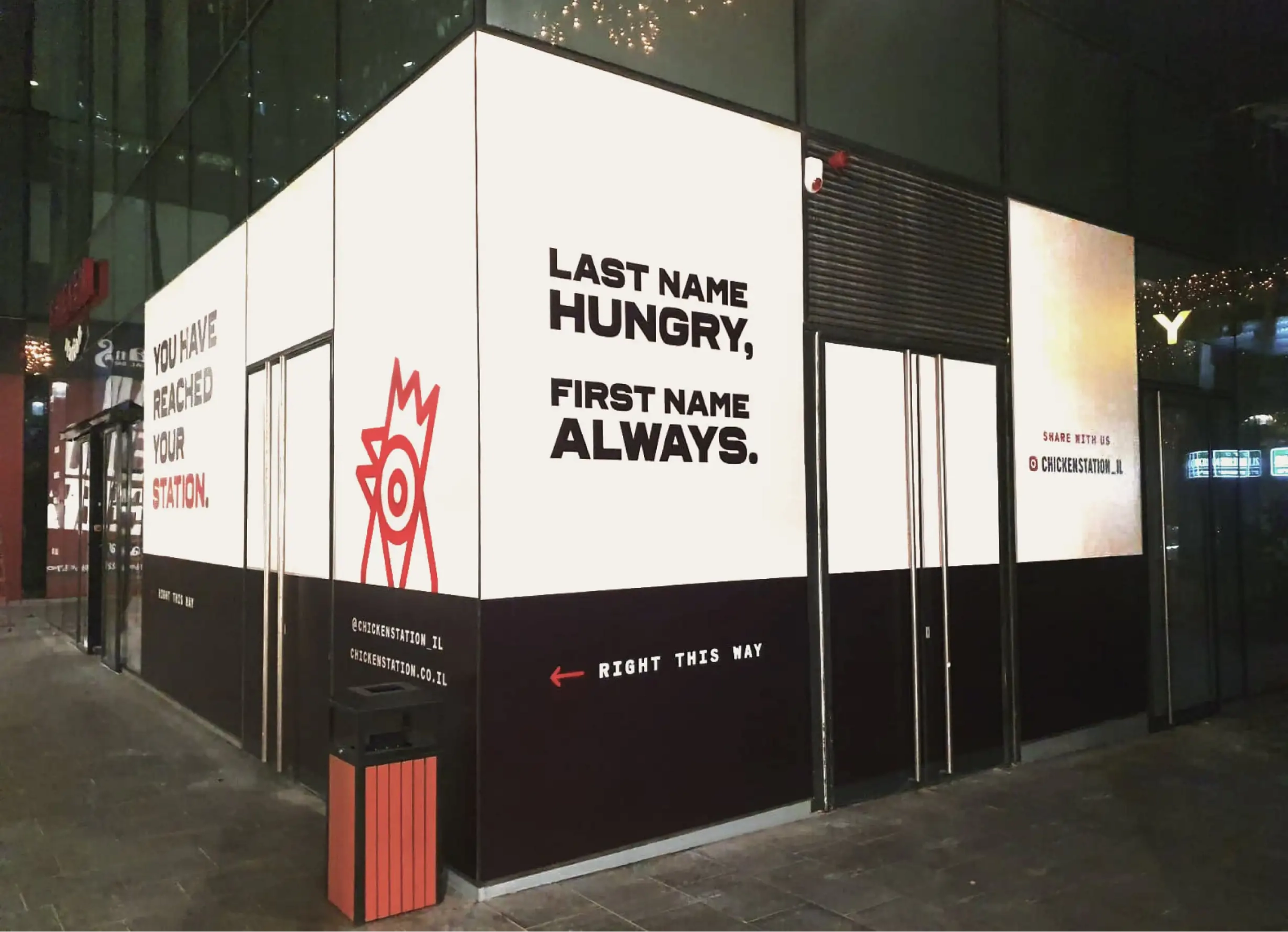
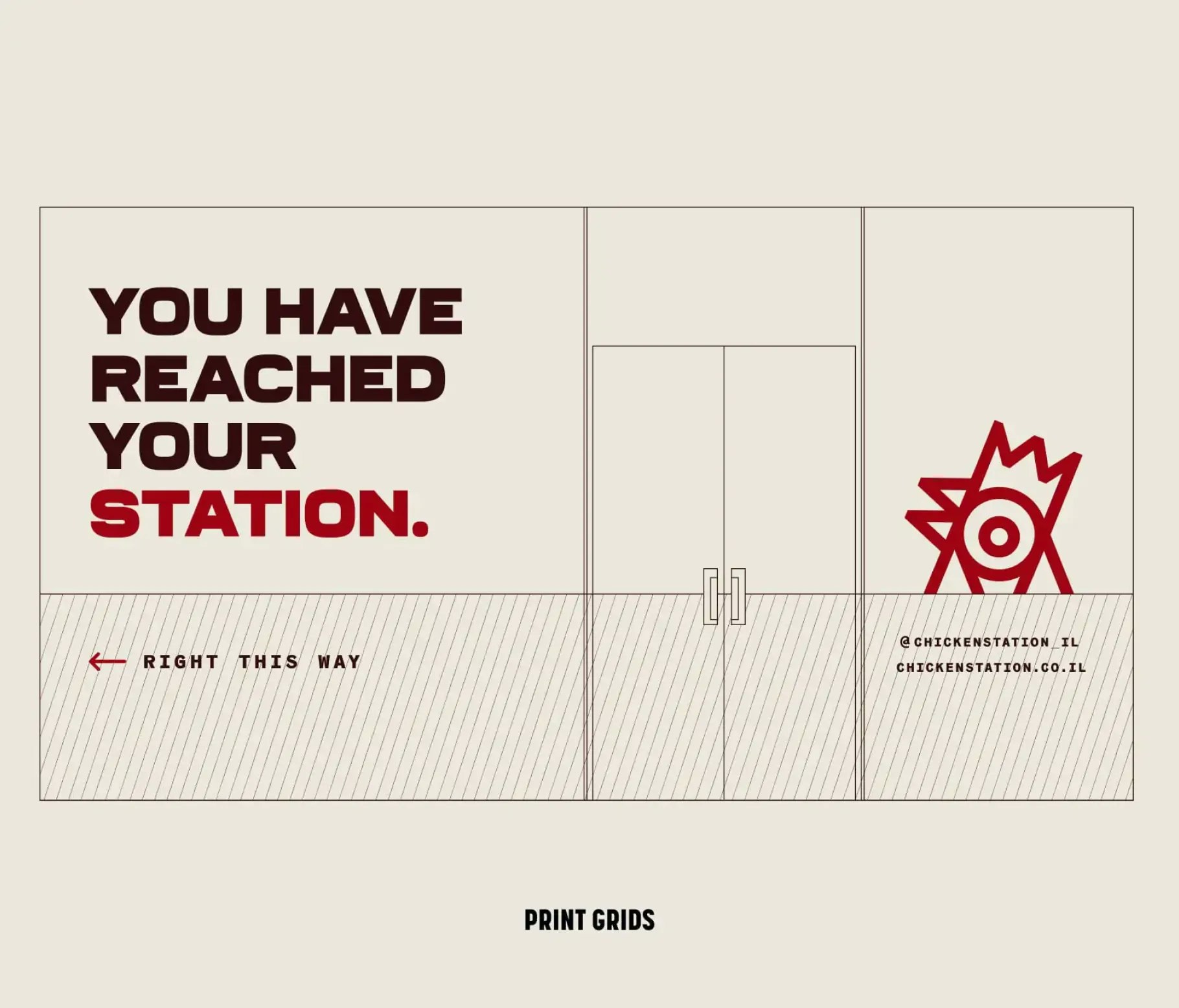
The clear standardization of brand assets, and physical collateral has led the company to be able to expand and scale efficiently.
The playful brand identity, rooted in color theory and best practices for fast food establishments has meant that franchisees have also not seen a need to “get creative” with what was made.
Get in touch